RPower Company Overview
Pre-Production
Concept & Scripting
The RPower Company Overview animation was built to introduce a complex energy resilience service in a short, punchy runtime—maximizing clarity, visual authority, and impact without drowning the viewer in technical detail. From day one, the goal was to frame “Resilience-as-a-Service” as a simple, turnkey solution backed by deep infrastructure expertise and smart financial structuring. Managing the balance between sophistication and simplicity shaped every choice during pre-production.
Scripting kicked off with a focus on declarative, high-confidence language designed to pair tightly with bold visuals. Key brand phrases like “100% operational” and “No upfront cost” were locked in early and became narrative anchors around which visual sequences were built. Multiple wording options were explored to fine-tune the tone—landing on a voice that felt urgent yet strategic, positioning RPower as a critical operational partner, not just another service vendor.
With a tight timeline and minimal client-side previsuals, we relied heavily on internally developed story logic, using proven structures from earlier technical explainers.
Rapid Prototyping
Previsualization strategy was pragmatic: rough out the entire video in Cinema 4D using basic viewport lighting and low-poly placeholder assets. This let us quickly block camera moves, define spatial relationships, and test transitions without getting bogged down in heavy materials or lighting early on. Viewport renders were composited in After Effects, where temporary charts, animated masks, and placeholder UI overlays gave the client clear previews of timing and visual flow.
One of the intro shots—the blackout aerial—was prototyped completely in After Effects. Using converted KML/KMZ city maps layered in 3D space, we built an animated blackout sequence driven by mask animations tied to camera moves. This method bypassed the need for heavy 3D renders while allowing full control over light decay, blackout wave timing, and dynamic logo reveal integration.
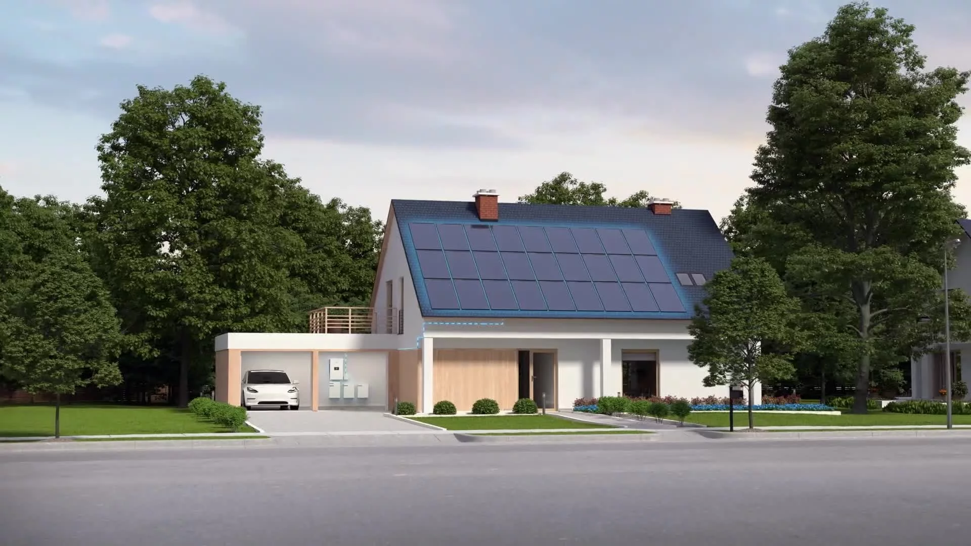
Core 3D assets like generators, the semi-transparent facility structure, and energy flow paths were blocked in C4D using splines and Mograph cloners. Early versions prioritized scale, timing, and framing—getting generator placement and data flow dynamics dialed before adding final asset detail. Generator models were simple models during RP, ensuring physical structures and later UI overlays would be visible and logically spaced from the beginning.
Collaboration with the client was focused and efficient. Weekly review links allowed asynchronous feedback, keeping the conversation aimed squarely at functional storytelling rather than polish. Engineering and marketing stakeholders weighed in consistently—shaping infrastructure realism, energy logic clarity, and technical messaging along the way. For example, “Demand Response” and “TDSP Rate Reduction” were initially separate visual beats but were streamlined into a unified animated bar chart to sharpen delivery.
Prototyping Animation Concepts
We prototyped electricity flow using spline path animations, driven by cloner arrays to simulate dynamic branching. Floating UI panels and data icons were built as 3D null objects, parented to generators or major facility points, allowing for early testing of how infographics would track to moving 3D elements during animated sequences.
The RAAS logo reveal was another early testbed. Animated in C4D and comped over preliminary backgrounds, different angles, lighting setups, and timing curves were tested to find the clearest, most emotionally charged moment for the neon-lit activation of the logo.
Client Feedback Shaping Direction
Client feedback during RP was detailed and actionable. Key notes emphasized visual hierarchy—pushing for greater logo contrast during the reveal—and messaging precision, such as updating phrasing from “Retail Electric Supply” to “Backup Generation Agreement” for technical correctness. These changes were incorporated early, reducing the need for costly revisions later.
Importantly, the RP phase allowed us to align creative direction, timing, layout, and messaging well before heavy rendering or lighting complexity entered production. By locking structure early through prototype-driven collaboration, we eliminated guesswork and kept the production timeline lean and focused—paving the way for a polished final execution without surprises.
Production (Full Production / FP)
Look Development
Full production started with focused technical research on three core fronts: understanding blackout dynamics across city grids, studying crane rigging for generator installs, and referencing real-world specs for utility-scale generators. This background shaped everything from scene layout to mechanical realism, keeping the animation rooted in practical energy infrastructure while pushing a sleek, conceptual visual style.
The base facility structure was rebuilt with optimized geometry to support a semi-transparent custom shader. Using a fresnel-driven transparency curve and layered emissive edge outlining, we allowed camera angles to dynamically control visibility without manually keyframing object fades. Early test renders validated the fine line between readability and cinematic depth.
Material development shaped the visual tone. The RAAS title sequence, in particular, demanded a premium, high-tech finish. A custom plastic shader was created with multi-layered micro-displacement, giving the RAAS letters a semi-gloss, machined polymer surface. Lighting the scene followed best practices: a calibrated HDRI dome for ambient reflections paired with targeted area lights to sculpt the extrusions and circuit-plated surfaces. Reflection roughness was carefully tuned so logo edges caught just enough highlight without excessive glow. The cable connecting into the RAAS lettering was spline-animated, carrying a traveling emission pulse that visually linked the logo back to the system’s live energy flow theme.
Design & Animation
The generator sequences had to hit the balance between realistic detail and stylized clarity. Accurate dimensions for the GENERAC units were recreated, covering everything from panel seams to intake grids and base skids. Materials followed PBR principles—housing units had tightly controlled specular behavior, while rubber handles and control panels contrasted subtly against coated metal finishes.
Facility architecture was lightly detailed with stairwells and wall frames, but kept visually clean to support render performance and avoid clutter. Energy conduits came to life through spline-based animation, with Redshift emission shaders applied over animated texture coordinates to simulate alive, branching power flows. This animation language directly supported the narrative of power activation and controlled distribution.
Camera choreography was tuned for both cinematic presence and technical clarity. Deep dolly moves and rotational pans were guided with spline-constrained rigs, allowing perfect focus pulls that highlighted energy lines and UI elements exactly when needed. Object distance expressions drove automatic focus shifts, ensuring fluid, narrative-synced depth transitions.
The RAAS reveal shot was built as a hero moment. The camera opens on a textured modular panel, reminiscent of industrial flooring. From there, the RAAS letters emerge, beveled and backlit to feel engineered into the structure itself. Each character was individually modeled for bevel variation and slight imperfection, avoiding the sterile look of procedural fonts.
The internal faces of the text were layered with emissive shaders and a subsurface scattering pass, creating a soft glow that diffused into surrounding metal surfaces—closer to illuminated acrylic than raw LED. The traveling cable pulse triggered a volumetric light burst timed with the camera push-in. Redshift’s glare system rendered physically accurate light streaks, adding cinematic lens texture without artificial bloom.
All motion design in this sequence reinforced the embedded, engineered feel—energy flowing through hardened systems rather than ornamental lighting effects.
Technical Strategy
Scene management was built for efficiency. Generator models were instanced to maintain flexibility in shot lighting and material tweaks without ballooning project size. Spline tracer systems for the conduit animations were baked to Alembic caches, locking in high-frequency movements and stabilizing timeline playback during layout and camera work.
UI elements and nulls were precisely tracked and exported from C4D to AE, maintaining parallax integrity. This allowed floating panels like "No Upfront Cost" or "100% Operational" to exist spatially in the 3D world, tracking naturally with camera moves and preserving late-stage edit flexibility inside After Effects.
Lighting adhered to the core principle of minimalism with purpose. An HDRI provided soft, neutral ambient lighting, while targeted area lights sculpted key reflections across transparent walls and generator bodies. Test renders fine-tuned key ratios, ensuring emissive paths and UI panels popped against darkened architectural backgrounds.
Style Choices and Reasoning
The visual language was intentionally hybrid—a clean collision of stylized architecture, holographic energy flow, and grounded realism. By semi-transparently revealing the facility, we allowed viewers to conceptually "see inside" without clutter, highlighting energy activation and infrastructure flow without mechanical overload.
The generators stood apart with full physical realism—modeled, textured, and lit to emphasize industrial quality. Their presence anchored the abstracted environment, providing a tactile point of trust and stability.
Lighting choices emphasized contrast and rhythm. Darker spaces gave weight to light activations, while HDRI reflections kept transparent surfaces lively without introducing environmental noise. Typography and messaging used a digital-industrial fusion—bold, spatially integrated, and reactive to scene geometry—echoing themes of infrastructure intelligence and resilience.
Color palette decisions leaned on neon green, cool blue, and crisp white—signals of energy innovation, technological readiness, and forward-focused reliability. Every visual choice reinforced RPower’s story: not just resilience, but smart, modern infrastructure at work.
Collaboration & Revisions
Given the technical complexity and conceptual load, collaboration loops were tight and deliberate. Early stills from major sequences—like the RAAS reveal and facility activation—were reviewed with the client for shader fidelity, lighting tone, and branding alignment before full animation runs.
Viewport passes of key dynamic shots, like the generator drops and energy line activations, were shared for feedback on motion pacing and camera work. Fine-tuning focused on ensuring each shot carried enough drama without losing technical credibility.
Text overlays, panel movement speeds, and signal pulse rates were all adjusted based on feedback, ensuring every floating message felt physically real and brand-authentic.
Challenges and Solutions
Balancing realism and abstraction was a central challenge. Facility transparency had to read cleanly without making the scene feel busy. Fine-tuned fresnel curves, falloff visibility tricks, and emissive edge glows were layered to achieve dynamic readability without flatness.
Animating spline-based energy lines through complex geometry was another technical hurdle. Alembic caching solved stability and playback issues, ensuring clean exports and consistent motion timing across heavy scenes.
Shader complexity—particularly for the generator metalwork—required layered procedural detailing to deliver industrial credibility under cinematic light rigs.
Lighting revisions moved from an initially flat approach to a rhythmically lit system, where HDRI ambient tone and surgical area lights combined to drive focus, create shape, and emphasize flow dynamics.
Lastly, memory and render optimization were critical with so many moving elements—splines, emissives, volumetrics, UI overlays. Alembic baking, strategic scene instancing, and render layering gave us the flexibility to sustain high visual polish without overwhelming the pipeline.
Post-Production & Delivery
Blackout City Map Visualization
The night aerial blackout sequence was complex and symbolically important moments in the RPower video. Built entirely in After Effects, the scene used real vector-based city map data, imported from KML/KMZ files, giving full control over the blackout patterns through animated masks tied directly to the 3D camera movement. Instead of a flat map reveal, the city grid was constructed in layered 3D space, allowing for depth and natural parallax as the camera pushed in.
Animating the blackout meant crafting detailed mask animations across city district layers, staggered with offset timings to replicate the domino effect of a real cascading grid failure. Secondary effects added realism: small roadway light flickers, delayed dimming in minor grids, and soft emissions fading naturally instead of disappearing instantly. These layers heightened emotional tension, driving home the fragility of conventional power infrastructure and setting the stage for the story of resilient generation.
The blackout sequence transitioned seamlessly into RPower’s brand message, with a synchronized energy surge that triggered the logo reveal. The logo glow was timed with a smooth brightness pulse, reinforcing the emotional pivot from vulnerability to resilience and renewal.
Infographics, UI Overlays, and Data Visualization
Floating UI panels and animated infographics were another major refinement area in post. Built directly in After Effects, major panels—like “No Upfront Cost,” “Ultra-low Emissions,” “Demand Response,” and animated savings charts—were dynamically parented to 3D nulls imported from Cinema 4D. This kept every panel spatially aligned to the moving 3D camera, ensuring natural depth behavior and maintaining immersion.
All UI elements followed a minimalist, highly technical aesthetic: transparent panels with clean line strokes, soft glows, and hover-state motion designed to suggest live system feedback. Typographic hierarchy was tightly controlled, balancing bold, high-contrast headlines with secondary detail rendered in lighter weights and smaller sizes to minimize clutter and maximize message clarity.
Animated charts received special motion treatment. Rather than basic linear keyframes, custom easing curves were applied, producing smooth, progressive growth animations that visually reinforced themes of optimization and efficiency. Power savings graphs and operational charts were enhanced with animated glow sweeps, creating a sense of accelerating technological progress.
Additional VFX touches—like spark effects behind power lines and dynamic connection points—added subtle energy to the data visualizations, increasing visual interest without distracting from the primary message.
Compositing, Color Grading, and VFX Enhancements
Compositing unified all visual elements—3D renders, UI panels, optical effects, and environment overlays—into a single, cohesive visual experience. Cinema 4D and Redshift renders came in as multilayer EXR files, giving complete control over emission, reflection, depth, and matte passes.
Color grading took a minimalistic, grounded approach. Darker grades were applied to facility interiors and night exteriors to allow emissive elements and UI panels to stand out cleanly. Glow passes for energy flows, generator activations, and the RaaS title were enhanced with timed exposure ramps to emphasize narrative beats.
The RaaS title reveal received special treatment. Layered glow effects combined with subtle chromatic aberration introduced a tactile, illuminated finish. Ambient occlusion passes were selectively composited to deepen the visual weight between letterforms and their surrounding structures, emphasizing dimensionality and anchoring the installation physically in the scene.
Lens flares, ripple distortions during blackout recovery, and subtle flickers over critical UI panels brought extra polish and cinematic energy to the final scenes.
Final Assembly and Delivery
Editing and final assembly were completed in Premiere Pro, stitching together AE-rendered sequences with locked voiceover and polished sound design. Shot pacing was tightened during assembly—balancing dynamic cuts between blackout recovery and facility activations, while maintaining enough breathability for each scene to land emotionally.
Deliverables included:
A 1080p H.264 master for general distribution
High-resolution stills from key moments for marketing and social use
An SRT closed-caption file for accessibility
Every export was checked for consistent color calibration across platforms, ensuring the final video matched the intended visual tone on both calibrated monitors and standard playback devices.
The full project review confirmed that every aspect—from the conceptual holographic visuals to the layered energy flows, to the precision UI motion—reinforced RPower’s brand story as a resilient, forward-looking infrastructure leader.
Transcript:
Backup generation is essential to today's businesses seeking 100% power resilience for their operations.
Introducing RPower. It’s turnkey resilience as a service.
RPower will design, engineer, install, own, operate, maintain, and optimize the generation. It's a simple and revolutionary way to get on-site backup generation that size to meet 100% of your power needs.
Here's how it works. There's no upfront cost. We install Generac’s ultra-low emission natural gas utility-grade generators at your location. So if the utility power fails, all your operations continue uninterrupted. But that's only half the story.
RPower guarantees power bill savings by operating your generator to reduce your delivery charges and minimizing your exposure to peak prices. And our power manages everything beginning to end, leaving you to focus 100% on your business.
Your business will be 100% operational 100% of the time. No matter what.
Are you ready for resilience?
Call RPower today.