Company overview
Pre-Production
Concept & Scripting
The animation was built to position B&E Resources as a future-ready industrial services provider—modern in capability, national in reach, and deeply tied to its Gulf Coast roots. This wasn’t just a capabilities video. It was designed to synthesize B&E’s core pillars—culture, coverage, and services—into a unified visual narrative that communicated clarity, control, and precision. The style needed to feel elevated and contemporary without losing the grounded authenticity of a boots-on-the-ground services company.
The script was structured around four primary narrative modules: services, facilities, company values, and geographic reach. This gave us room to establish clear, compartmentalized logic for each differentiator while weaving a consistent stylistic thread through the piece. Key messaging phrases like “Exceptional Service,” “Responsive and Reliable,” and “Committed to Safety” were carved out as standalone graphical moments—giving them space to land as thematic visual interludes. The script was carefully balanced between hard data points (square footage, field offices, equipment) and abstract brand concepts (workforce, values, reputation). That required both architectural fidelity and conceptual metaphor—shifting between literal representations and stylized sequences that conveyed mission and mindset.
Creative development was grounded in reference materials from the client: brochures, logos, fonts, and footage of their facilities. Additional content—photography, shop floor video, and brand visuals from across their campuses—helped guide the modeling and compositing work. These inputs shaped both the look and the narrative logic, showing us how to visually abstract physical operations into a high-clarity, future-facing brand story.
Rapid Prototyping
The RP phase focused on building a rough, low-fidelity version of the entire piece—a skeletal map for how timing, transitions, and tone would work. This included rough modeling, shader exploration, and AE compositing tests to validate whether the holographic style could actually support the story without introducing noise or visual friction.
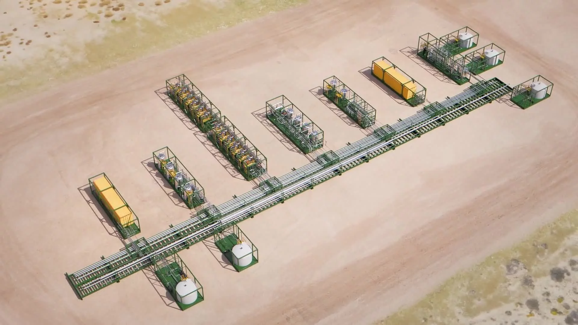
We modeled core facility buildings for Houston, Buna, and Silsbee from scratch, using aerial imagery and ground-level photos. The goal wasn’t full realism—it was spatial accuracy. These models would anchor location-specific moments that showed fabrication and field service capacity. Refineries, tank farms, and infrastructure assets were pulled from an internal 3D library—modular components like exchangers, towers, and piping clusters selected for clarity and compatibility with animation logic.
The U.S. map base was built from a 10K elevation dataset and processed into a 3D mesh. This allowed for geographic scale, camera movement, and terrain realism. To define state lines, we imported vector GIS data as splines and extruded them slightly above the terrain—a subtle move that reinforced clarity without clutter. These outlines were used during early motion blocking to test flyovers and spatial orientation.
Shader work wasn’t a major focus during RP. A simple translucent, holographic material was applied to all infrastructure models to test readability. These early shaders emphasized edge visibility and depth, using refraction and emissive gradients to simulate light-passing through transparent structures. Several variants were tested to see how these materials responded under different lighting conditions and background compositions—especially when layered with post effects like glow, blur, or vector overlays.
After Effects was used extensively to prototype post treatments. AE mockups included vector UI, animated callouts, low-opacity data grids, and atmospheric particle passes. We tested directional blur, chromatic glow, CC Ball Action, and other stylized treatments—especially for transitions and interstitial sequences where brand messaging or logos needed to shine. These tests helped establish post-production logic and informed how literal 3D elements could coexist with stylized overlays.
Simultaneously, we blocked out camera movement in Cinema 4D using spline-based motion and null targeting. These early motion paths created the backbone for region-to-region transitions, topographic flyovers, and facility reveals. Animated assembly sequences—such as building up refinery infrastructure—were simulated using visibility toggles to sketch out pacing and sequencing that would be refined in full production.
Early Visual Styles Explored
The holographic aesthetic went through several test iterations focused on transparency, edge clarity, and motion readability. Each facility model was tested under different scales and camera angles to ensure that translucent geometry remained legible when surrounded by animated noise, particles, or UI overlays. The goal wasn’t realism—it was high-functioning abstraction.
We gave special attention to how the camera could guide attention through dense information without losing the thread. Conceptual scenes for core values like “Safety” and “Integrity” were also prototyped—stylized text rendered in 3D, layered with depth blur and dynamic noise to suggest meaning without literal footage.
The B&E logo was brought into 3D and animated for transition tests. One standout test composited shop footage directly into the letterforms using ID passes, paired with CC Ball Action to simulate a pixel effect. This visual treatment reinforced the holographic theme while maintaining the grounded, real-world DNA of B&E’s operations.
At this stage, polish was secondary to coherence. RP scenes were lit minimally and camera motion was intentionally raw. We were looking for visual language viability—what worked, what didn’t, and how real-world elements could be abstracted into a consistent, scalable design system. These early style tests became the blueprint for shader tuning, animation logic, and post-processing structure in production.
Production (Full Production / FP)
Look Development
With the visual direction locked in during Rapid Prototyping, Full Production shifted into high-precision execution. This phase was all about dialing in fidelity—polishing key assets, optimizing render strategy, and finalizing the conceptual aesthetic using Cinema 4D paired with Redshift. Choosing Redshift over the Physical renderer wasn’t just about speed—it was about quality where it mattered. Redshift gave us the performance headroom to push the project’s signature holographic look: transparency, emissive shaders, and complex lighting that would’ve buckled under standard rendering.
The terrain model from RP was reworked into a stylized, multi-band elevation system. We used contour slicing and clean polygon subdivisions to break the mesh into stepped terraces—digitally sculpted topography that felt engineered and architectural. There were no textures, no surface noise. Just clean geometry reinforced by smart material layering and lighting behavior in Redshift. It allowed infrastructure clusters to sit clearly within geographic boundaries and kept the whole thing feeling more like a system diagram than a map.
The shader system was built using Redshift’s physically based layering. At its core was a semi-transparent glass material with a low IOR to keep distortions down, enhanced with transmission depth for subtle volumetrics. Edge glow came from Fresnel falloff, and emission channels were used to carve out visual contrast along the silhouette lines. Shader variants were applied based on structure type: central facilities got more glow, utility infrastructure had tighter transparency control, and clustered objects used low-refraction settings for clarity in dense compositions.
Lighting stayed lean and purposeful. Flat HDR environments were used to avoid shadows and prevent color bleeding. Redshift’s emissive materials carried the visual load—powering glow and highlight behavior while keeping the base render neutral. This approach aligned with the larger pipeline strategy: all bloom, diffusion, glow, and chromatic effects were slated for post in After Effects. That meant Redshift had to deliver clean, balanced passes with precise light values and no baked-in styling noise.
We introduced a structured grid plane as a key scene element using Cinema 4D’s Mograph Cloner. Made up of square tiles with randomized Z-offsets, the floating grid formed a dimensional substrate underneath facilities, logos, and camera paths. It worked on two levels: first, as a visual metaphor for digital infrastructure; second, as a unifying backdrop that created continuity across otherwise disconnected scenes. Post would later layer in UI and light effects, but the base geometry and its animation logic were locked here.
The renders were tuned for local machines, with optimized ray depth, simplified reflection setups, and streamlined transparency stacks to keep the pipeline moving.
Design & Animation
Animation in Full Production followed a clear rule: stay deliberate. Every move was paced, every reveal modular, and every transition planned with spatial clarity in mind. Facilities were grouped and parented to nulls, then animated along axis-controlled paths to support clean flyovers, dolly moves, and orbiting reveals. Build sequences were created using Fracture objects and layered falloffs, allowing industrial structures to emerge in waves, stacks, or pulses—all timed to the voiceover.
In stylized scenes like the refinery build, pipes, stacks, tanks, and supports were layered to animate from central cores or unfold vertically in segments. Redshift’s ability to handle transparent overlap meant we could build dense scenes without Z-fighting or flicker during motion—huge for keeping the build-ups readable.
The 3D B&E logo was built out in high detail, with clean beveled edges and multi-layered shaders. It showed up in full-screen transitions and in-scene placements, always with consistent Redshift treatment: soft reflections, controlled transmission, and edge-focused emissions. In some cases, it floated inside the tile grid—positioned like a core system element—anchoring brand presence inside the visual system.
Cameras were driven by target-based rigs and spline-tracked null paths, with distance constraints to maintain clean focus. Every move had a purpose: slow dolly-ins, crane lifts, or orbiting pans—no whip pans, no visual noise. The pacing gave each scene time to breathe, letting the facility geometry and spatial layout actually register.
Redshift’s interactive render view made iteration fast. Test renders helped confirm spatial depth, shader behavior, and emission balance. We could tweak motion arcs and lighting passes without ever leaving the feedback loop—keeping everything on track for post.
Style Choices and Reasoning
The visual style wasn’t just a creative choice—it was a strategic one. B&E’s identity as a large-scale industrial services provider needed a visual language that projected precision, transparency, and control. The decision to go with 3D conceptual design and holographic abstraction wasn’t about flair—it was about communication.
Using translucent, glowing structures gave the audience something deeper than just a digital look. It made complexity visible. When a company handles civil, mechanical, electrical, and instrumentation work across petrochemical plants and water systems, the ability to show how those pieces connect—without clutter or distraction—is essential. The semi-transparent materials didn’t hide reality; they clarified it. They allowed viewers to "look through" the noise and see how systems function.
The style also signaled technical capability. B&E’s brand story centers around integration, scalability, and future-readiness. The design language—terrain slicing, floating tiles, precise facility builds—reinforced that. We didn’t try to replicate the real world. We represented it as a system. It was schematic, intentional, and structured—just like the company’s operations. That system logic hit the right tone for a brand focused on end-to-end project execution and engineering discipline.
Redshift supported that identity in practical ways. Its ability to manage clean transparency, support emission-heavy shaders, and provide consistent procedural control gave us the exact toolkit we needed to build a holographic, system-like world. It let us emphasize key moments with glow or depth gradients without compromising speed or quality. And with real-time feedback, it kept the production agile even when managing complex, layered shots.
The tile grid wasn’t just background—it was infrastructure. A repeating, dimensional pattern that implied digital order. The randomized height offsets avoided flatness while echoing ideas of modularity, prefab logic, and system architecture. That choice gave the visuals a subtle consistency—making every facility feel like part of a larger engineered whole, even across different geographies. For B&E, that was brand-aligned. It suggested order, integration, and control—exactly the story they needed told.
Keeping 3D scenes clean—free of text, labels, or UI—was another intentional move. All data and messaging was held for post in After Effects. That gave us maximum flexibility. Rendered visuals became a neutral base, and messaging could be dropped in, updated, or reordered without re-rendering. For a technical brand like B&E, where late-stage changes or spec shifts are part of the process, that modularity was critical.
What this style ultimately delivered was something few industrial animations manage to hit: precision, scale, integration, and vision—all without resorting to literal footage or conventional diagrams. It took the B&E brand out of the job site and into a strategic system view. The holographic world positioned them not just as contractors—but as infrastructure orchestrators. Technically grounded, but strategically elevated. For a company that operates at scale and with precision, this visual language said exactly what needed to be said—and did it with clarity.
Post-Production & Delivery
Final Compositing & Color Grading
Post-production for the B&E project was purpose-built and layered with precision. After all foundational 3D passes were rendered in Redshift—containing only the base holographic elements like terrain, facilities, and the tile grid—After Effects became the control room. This is where the narrative, the message, and the brand identity came together and got dialed in.
Every Redshift render pass was treated as a clean, neutral base layer. Object ID passes gave us the ability to surgically target individual buildings or map zones—boosting glow, adjusting edge treatment, or isolating emission levels right where needed. Color grading across the project was unified through shared curve adjustments tuned to a cool, cinematic palette. Think whites that stayed clean, cyan glows that carried the energy, and deep steel blues that reinforced the technical tone. Scene-specific tweaks—selective color shifts and exposure offsets—kept visual consistency and made sure focal points always hit where they should.
To build depth and realism into the abstract environment, we layered in cinematic effects. Chromatic aberration was added subtly to the outer edges of each frame, nodding to real lens behavior and reinforcing the holographic visual system. Simulated depth of field, driven by Z-depth data and AE’s lens blur plugins, helped direct the viewer’s eye through layered shots. A faint vignette wrapped around every scene—creating cohesion, softening transitions, and guiding visual rhythm from beat to beat.
VFX Enhancements
The clean Redshift renders served as a base—not the finish line. Compositing layered in subtle but essential visual effects. Glow effects were used along structure edges, grid seams, and facility outlines—enhancing form without burying detail. These glows were often stacked and additive-blended to create controlled bloom without oversaturating the holographic shader work.
Most of the UI and motion graphics were composited fully in After Effects. This included titles, data callouts, location tags, certifications, and service highlights. While 2D in construction, they were positioned inside AE’s 3D space using imported camera data from Cinema 4D. That let them lock into shot geometry and track naturally with pans, zooms, and orbits—so even though they were built separately, they felt physically anchored to the environment.
Additional graphic elements—grids, flickering data points, glowing overlays—were layered on top of the tile plane to reinforce a sense of underlying digital activity. These weren’t procedural FX baked into 3D—they were animated assets composited in AE using blend modes and blur passes to keep them soft, subtle, and stylistically in sync. In the facility map sequences, state outlines were added in post, traced from vector GIS data and stylized with glow and parallax to create regional clarity without adding clutter.
One standout VFX sequence centered around logo integration into the tile grid. Company logos were composited into specific tiles using perspective distortion and CC composite techniques. A radial blur was added to create soft emission rays radiating from the tile edges—implying that B&E’s identity was built into the operational foundation itself.
Infographics, UI Overlays & Data Visualization
There were two main layers of graphic content in this phase: conceptual overlays (services, locations, brand values), and data-focused infographics synced to the editorial flow. Everything was built modularly, aligned tightly with voiceover cadence, and locked to the timeline structure.
Examples of key UI executions included:
The US map build, with animated callouts marking field offices and production facilities. Glowing arcs and node pulses expanded outward to show operational reach.
The operational footage grid, composited as a matrix of video tiles with individual color grades to maintain visual consistency and unify tone across B-roll.
The floating service diagram, which connected B&E’s capabilities via animated lines and soft-glow nodes. This was built in AE using 3D layer parenting to simulate network logic and give the diagram spatial depth.
The 3D B&E logo, which got multiple treatments—most notably, a version over live-action shop footage with CC Ball Action applied to create a shimmering digital dissolve, symbolizing innovation and transformation.
Transition sequences between content blocks were created using Element 3D, giving us flexibility while maintaining stylistic alignment with the Redshift-rendered geometry. Reflections and glow within the plugin were tuned to match the look and feel of the broader holographic environment.
Final Edits & Optimization
Once the full composite was approved and synced with the voiceover, editorial shifted focus to final timing, copy adjustments, and pacing calibration. Because of the modular compositing setup, late-stage text updates, brand refinements, or value proposition swaps were handled quickly—without the need to touch base renders. This kept the pipeline flexible and responsive all the way through delivery.
Final color grading passes unified the contrast structure between rendered base layers and overlaid graphic content. Small lens flares were layered onto high-emission zones—facility hubs, logo moments, major callouts—to provide a final layer of light realism and polish that reinforced the high-end brand tone.
B&E’s fonts, color system, and visual identity were followed to the letter—without being boxed in by templates. Hierarchy drove the layout: value props and the company name always stayed within the viewer’s visual priority zone, usually above center or placed along key focal arcs. Color stayed in the cold spectrum—cool tones with slight warm accents where needed. No unnecessary saturation. Everything was designed to feel engineered, clean, and on-brand.
The final visual tone—structured, abstract, digital, but grounded—hit the balance B&E needed. It communicated their operational precision, their systemic thinking, and their future-ready positioning in a way that felt distinct and durable.
Delivery
The finished video was delivered in full HD (1080p) as an H.264-encoded master file, ready for both internal and public-facing use. An SRT subtitle file was provided to support accessibility and international applications. Thanks to the compositing structure, alternate versions and future updates can be executed quickly—without touching the core visuals—ensuring this asset continues to serve B&E over time.
Transcript:
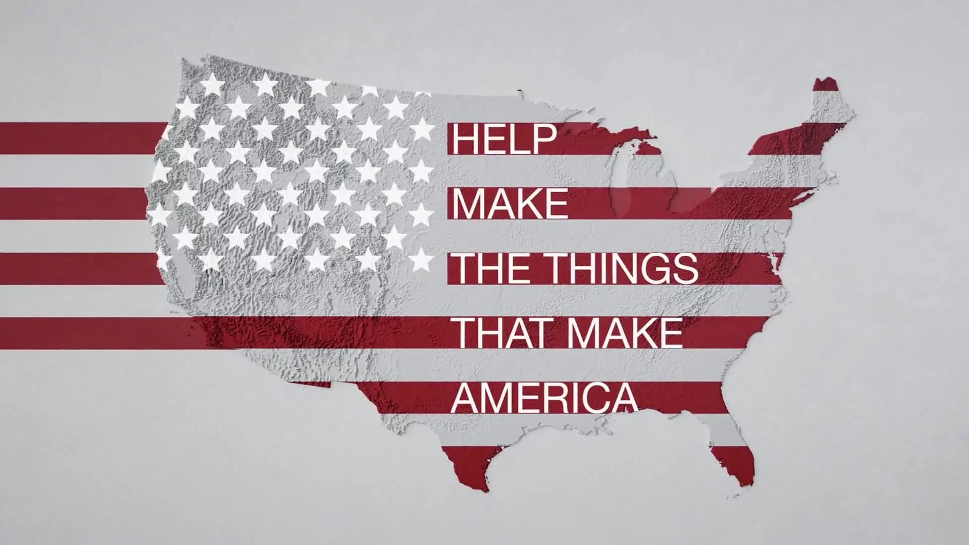
We are B&E Resources - a best-in-class industrial service and specialty fabrication company providing integrated solutions to many of the largest refinery, petrochemical, paper and water treatment companies in the world.
Headquartered in the Golden Triangle in Beaumont, TX with three major production facilities along the Gulf Coast and field service offices in key areas B&E is not only ready to meet your needs…
We’re ready to exceed your expectations, earn your trust and accelerate your success now and in the future.
For our blue-chip industrial clients, B&E provides a full range of services from project engineering, procurement and construction management for large capital renovations and expansions, to ‘nested’ civil, mechanical, electrical and instrumentation teams handling routine small capital projects and the maintenance, repair and replacement work necessary to keep plants running.
By self-performing the structural steel and pipe and vessel fabrication required to support our field service jobs, B&E is able to control the quality, cost and timeline of projects – a strength our clients have come to rely on.
For B&E’s world-class specialty fabrication clients, we design, engineer, fabricate, paint and assemble major structural steel, pipe and vessel and process equipment packages to the highest standards.
Our field service capabilities include start-up and commissioning, ongoing electrical and instrumentation, and recurring maintenance, repair and replacement of critical parts and packages.
Known for our fanatical commitment to safety and quality, we spare no expense in training and equipping our people to ensure the highest degree of safety and excellence in all of our production facilities and on all of our jobsites.
We maintain an array of industry certifications and accreditations and we ensure the raw materials we use are premium quality, traceable, and price-competitive.
B&E’s three major production campuses feature a combined 200,000 sf of fabrication, paint, machining and assembly capacity for meeting even the toughest project demands.
At 110,000 sf, our Houston facility boasts structural steel fabrication and equipment package assembly, machining, and painting capacity, including 35 acres of yard for rig-ups, lay down and material staging.
It also houses secure, on-site client offices that can support a part or full-time presence if desired.
B&E’s 30,000 sf facility in Buna, Texas is concentrated on pipe and vessel fabrication but also delivers indoor blast and paint capabilities. The site encompasses a 104-acre laydown yard, as well.
And our 40,000 sf facility in nearby Silsbee has a dedicated and segregated alloy shop, packs additional pipe and vessel fabrication capacity and a 20-acre laydown yard.
B&E’s industrial field services work is backed by a robust network of field offices across Texas and in Louisiana and Pennsylvania to support our clients.
Rounding out our extensive domain expertise and scalable production capacity is B&E’s dynamic team of talented professionals who are passionate about working together to craft new ways to solve our customers’ problems and make us better.
It’s no mystery to them that the magic of B&E is found in the shared core values that unite and inspire our team… and make the B&E family so special.
The combination of capacity, coverage, capabilities and culture is what sets B&E apart.
We love what we do, we love how we do it, we love doing it well and we love doing it together.
That is what the B&E family is all about.