DAS - Product Explainer Video
Pre-Production
Concept & Scripting
The concept behind the DAS explainer video centered on a single, high-stakes goal: clearly convey the depth and complexity of Borehole’s subsurface monitoring system without watering down the science. DAS tech pulls from fiber optics, acoustic sensing, strain mapping, and production profiling—all running in parallel across time and space within a well field. The script needed to make sense of that reality in a way that engineers would respect and Borehole’s data-forward brand could stand behind.
We worked closely with Borehole’s subject matter experts to break the narrative into modular chapters: system overview, DAS fiber deployment, fracture profiling, cross-well strain, microseismic tracking, and production profiling. Each section was paired with a unique visual metaphor or simulation style so it could stand alone—but still contribute to a larger, full-field understanding. Voiceover scripting focused on tight, declarative lines designed for clarity first. Every draft ran through technical reviews to lock in terminology and accuracy.
Rapid Prototyping
Given how abstract and layered the content was, Rapid Prototyping turned into a core part of development. We used Cinema 4D to block out the entire sequence—simple models, basic animation timing, and camera paths across every scene. We sculpted subsurface strata using Boolean volumes, animated DAS fiber paths with spline tracers, and used Mograph cloners and matrix systems to rough out fracture activity and early particle behavior at field scale.
RP also became our testing ground for camera logic—from top-down orbital flyovers of well arrays to micro-level fly-throughs of individual perforations. The challenge: showing multiple sensor systems working in tandem without visual chaos. We solved this with structured framing, pre-planned depth-of-field, and a modular approach—each shot focused on one sensor layer before adding the next.
Client feedback showed up early and often—everything from hand-sketched diagrams to PowerPoint markups to time-coded frame notes. These were instrumental in refining wellbore geometry, DAS orientation, and fracture animation logic. Several RP passes were dedicated to repositioning key elements based on that direct, technical input.
One of the biggest hurdles in RP was managing information overload. The client stressed clarity over flash—one big idea per shot. So we stripped back overlays, scaled down emissive elements, and clarified signal animations to avoid cognitive overload. Each pass through RP was reviewed sequentially, annotated asynchronously, and revised with surgical focus—fine-tuning pacing, camera motion, and how each concept was visually framed.
Early Visual Styles Explored
The early visual dev work focused on making the invisible feel real. We needed to show things like acoustic waves, rock strain, and microseismic shifts in a way that felt engineered—not magical. After several shader tests, we landed on a layered transparency system for rock strata—with emissive edge highlights and fresnel glows. This gave depth and focus to “active” rock zones while keeping the contextual layers readable.
Fracture animations started with radial clones, eventually morphing into irregular expansion discs with procedural thickness tweaks—adding just enough randomness to feel authentic. Energy wave propagation across the field was tested using spline pulses, luminance-linked flows, and wave cascades, all synced to real-time fracture or acoustic events.
We also ran several tests for microseismic visuals—point clouds animated as burst clusters and polar arrays. We eventually settled on a more natural pattern with subtle randomness, enhanced by displacement noise to emulate the organic impact spread of real-world subsurface activity.
Prototyping Animation Concepts
Each module’s animation logic was mapped and tested in RP. DAS fibers were animated along spline paths using Null rigs, built to mimic signal transmission in a stylized way. They glowed with variable intensity, tied directly to key events like fracture initiation or acoustic rebound. This approach kept the form abstract, but the function clear.
Fracture propagation was built procedurally. Cloner systems created disc bursts that triggered sensing activity in nearby monitor wells. Tracers and pulses visualized the detection path, connecting source and response. These animations were modular—making it easy to tweak timing based on VO pacing or updated client input.
Camera paths were built using C4D’s rigging and graph editor tools. We focused on smooth dolly-ins, orbitals, and vertical pans with easing curves to maintain readable spatial relationships. Everything was paced to let the viewer follow fiber paths, fracture spread, and system behavior without motion fatigue.
Client Feedback Shaping Direction
Given the technical depth and moving parts, collaboration was non-stop and deeply detailed. Each RP round was followed by granular feedback—sometimes with pages of notes from Borehole’s engineers. Their expertise steered everything from how fracture geometry was visualized to how bar charts should be scaled and colored for interpretability.
One of the biggest structural shifts came from feedback around pacing. Shots initially designed as single sequences were split into smaller steps so each system—DAS, microseismic, strain mapping—had room to breathe. DAS became the narrative backbone, with the other layers orbiting around it. That hierarchy made the story easier to follow and gave us a stronger structure for the production phase.
Through all this back-and-forth, the explainer’s visual logic took shape: each service was isolated in its own shot, then connected into the wider well field system. Spatial links and temporal transitions built on each other until the full picture snapped into place—an integrated, data-rich monitoring system, visualized end to end.
Production (Full Production / FP)
Look Development
With scene timing, order, and camera structure approved during RP, Full Production locked in with a focus on material and shader development—aimed at transforming the conceptual holographic world into something cinematically rich and technically clear. The visual tone leaned digital-forward and high-precision, so every surface was purpose-built—especially subsurface volumes, fiber optics, and dynamic fluid elements.
The holographic effect was a core element, helping visualize underground layers like strata and completions. We built custom Redshift shaders using fresnel-based transparency, colored edge glows, and depth-linked emission ramps. Each material was engineered for motion readability: strata layers glowed at transitions, DAS fibers pulsed with signal-coded color shifts, and fracture zones distorted the surrounding geometry with subtle refractive cues. Active and inactive regions had distinct material profiles, making monitoring or flow states immediately obvious on-screen.
All shaders were modular and instanced, ensuring visual consistency while allowing service-specific color overrides. Physical materials were also built for surface assets like well pipes, fiber bundles, and tractors—featuring micro-flaked metallics, rubber dielectrics, and displacement-driven wear textures, all tuned for close-up and wide-shot fidelity.
Design & Animation
DAS fiber animations were spline-traced and baked to Alembic. This served two major functions: cutting playback lag in dense timelines, and locking frame-accurate animation for multi-pass renders. Once baked, the traces were instanced across multiple wells—preserving spline shape while offloading real-time compute strain.
That same workflow powered the logo animation, where glowing fibers form the Borehole mark mid-air. Built with Tracer rigs and baked to Alembic, it delivered optimized lighting and synchronized emission sweeps for high-polish final output.
The production profiling module introduced fluid sims into the mix. RealFlow handled internal wellbore dynamics—gravity, velocity, and pressure all tuned to realistic production behavior. These sims were also baked to Alembic and shaded in Redshift using a custom liquid material. Fracture and microseismic scenes brought extreme geometry demands. With millions of points representing fractures, seismic returns, and energy states, we leaned on MoGraph Multi-Instances. These particles rendered with full emission, blur, and depth fidelity through Redshift’s optimized instancing—keeping viewports responsive even at five-million-object counts.
Style Choices and Reasoning
The motion style prioritized minimalism and technical modularity. Each service—DAS, fluid profiling, microseismic, etc.—had its own visual rules, then converged in the final sequence. That segmentation allowed for depth without overload.
Visual layering made active data pop: bright pulses, high emission, and layered glow sat on top of dimmer, deactivated background elements. Contextual visuals like background wells and strata faded into dark or low-alpha tones to keep focus locked where it needed to be.
Camera language pulled from UI design and architectural visualization—slow orbitals, dolly-ins, and axial pans created a smooth, informed exploration of data space. Every camera move was graph-edited for easing, with subtle DoF transitions and tilt offsets that added realism without pulling focus from the data.
Technical Details
Lighting followed a clean, strategic setup: HDRI gave ambient tone, while area lights punched up key fiber events, fractures, or data signals. Global illumination was tuned to prevent haze buildup and minimize noise in layered scenes.
All animation modules were managed using C4D’s Take System. Each service got its own take, keeping animation clean and organized while allowing concurrent scene development. High-complexity events—like perforation blasts or signal jumps—were animated separately, then locked to a shared camera rig for final cohesion.
Redshift EXRs handled final output with full multipass control: beauty, emission, Z-depth, motion vectors, object IDs, and custom material masks. These enabled precise compositing in After Effects without needing re-renders. Renders were 16-bit float across the board to preserve fidelity and gradient detail, especially for emission and falloff.
Unique Animation Techniques
We engineered custom systems for a number of data visualizations. DAS signal flows were built with Cloner rigs populating spline paths. Signal bits were driven by effectors for staggered rhythm and randomness—animated with variable glows to avoid repetition and communicate dynamic sensor activity.
Fracture propagation visuals used linear field-driven cloners to simulate lateral pressure events. These discs rippled out from perforation points with modulated timing and distortion fields, designed to match VO pacing and suggest real-world asymmetry in fracture development.
Microseismic visualizations leaned into point cloud clustering. Instanced particles were noise-displaced and scale-jittered, then triggered in waves based on fracture timing. These evolved into spatial patterns that doubled as readable seismic maps—making chaotic data feel visualized, structured, and intentional.
Collaboration & Revisions
Production was tight-loop collaborative. Each module was shared for feedback as static frames and turntable renders before sequence-level assembly. This gave the client early visibility into geo layout, lighting balance, and shader fidelity—eliminating rework before hitting full render.
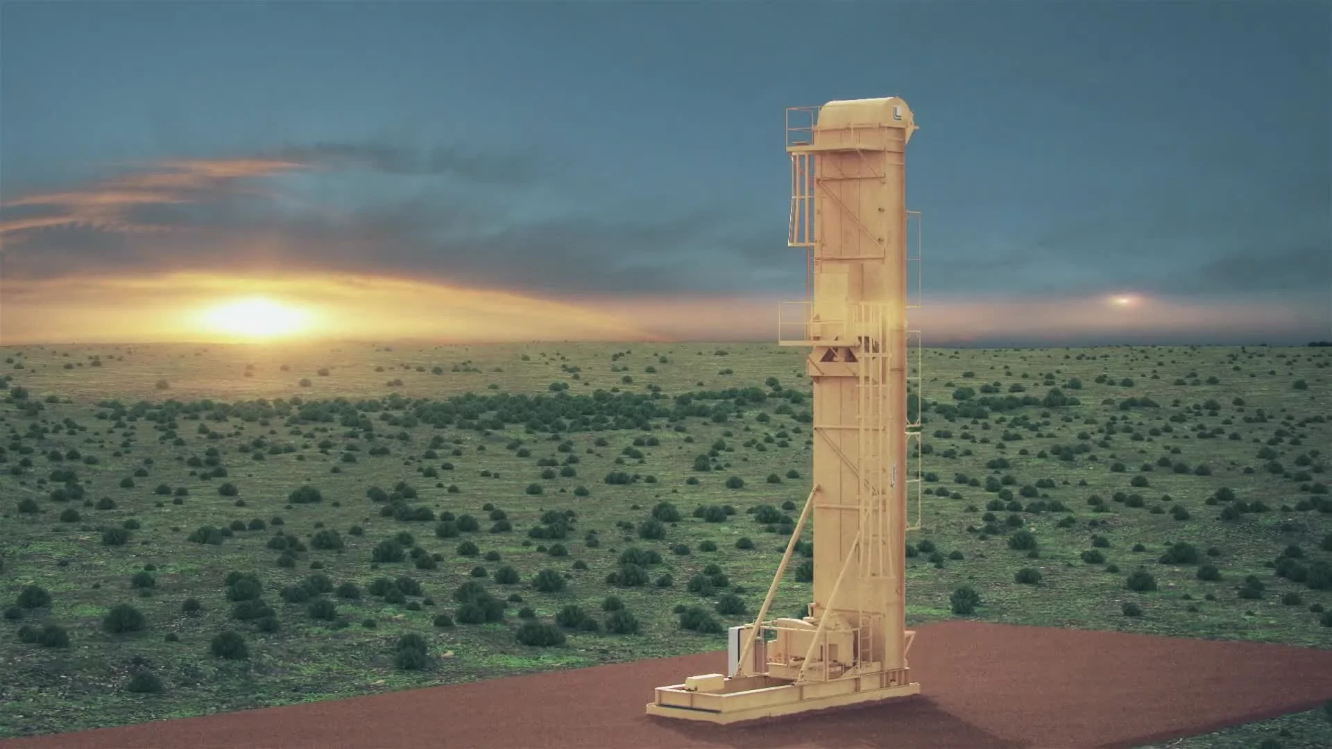
The Borehole tractor got extra attention. Client notes on mechanical fidelity drove a full model rebuild—reworking pipe routing, structural framing, and reflective shader tuning for hero shots, especially those highlighting sensor integration.
Challenges and Solutions
Scene complexity was the biggest technical hurdle. The combined weight of fluid sims, signal splines, fracture geometry, and stacked shaders risked pushing scenes past stable limits. We tackled this with a multi-pronged optimization plan:
Baked Alembic files for all dynamic elements—locking animation and killing live sim overhead
Multi-instancing via MoGraph to make particle-heavy layouts manageable in the viewport
The final result was a modular, high-efficiency production pipeline—delivering a technically dense, visually polished output that married scientific integrity with cinematic control.
Post-Production & Delivery
Final Compositing & Color Grading
Once all sequences were rendered from Cinema 4D as full-fidelity EXRs, compositing moved into After Effects—where every frame was layered for clarity, data precision, and pacing. The color grade leaned restrained but intentional, sharpening contrast between fiber signals, rock layers, and UI animations while preserving the stylized conceptual tone set in lookdev.
Redshift multipass outputs—beauty, emission, object ID, Z-depth, motion vectors—were used for targeted refinement. DAS pulses were brightened to read across strata cuts, strata base tones were darkened to isolate data overlays, and highlight roll-offs were shaped to control fiber reflection intensity. Z-depth layers drove lens blur in wide flyovers, softening background seismic patterns while keeping signals in crisp focus.
Additional comp layers—vignettes, glows, UI halos—were placed to guide the viewer’s eye toward live signal intersections, active wells, and key metric readouts. These overlays were calibrated against background terrain for balance, especially in moments where multiple sensor systems were active in the same shot.
VFX Enhancements
While most motion and lighting effects were captured in-render, key post additions sharpened the sense of responsive system behavior:
Shockwave glows and radial flares highlighted fracture triggers and strain events.
Glimmer trails were layered on DAS signal pulses using directional blur and animated falloff, enhancing wave motion.
A low-frequency oscillation field was composited into the final full-field shot, giving the seismic layer a soft, ambient presence.
UI overlays received micro-interactions—click flashes, response glows, pulse sweeps—that echoed real-time dashboard feedback. Even with static cameras, these subtle moves kept the interface feeling live and system-aware.
Infographics, UI Overlays, Data Visualization
Post featured some of the most labor-intensive design work in the project, including dozens of animated widgets, chart systems, signal callouts, and UI dashboards—all engineered to sit naturally in the 3D environment while remaining readable in motion.
Each UI system was visually tailored to its data function and synced to its VO segment:
Hydraulic Profiling: Floating vertical bar charts tracked fluid volume across 8 perf points. Teal represented water, orange/yellow for oil, with transparent overlays giving a glass-panel touchscreen aesthetic. Fill levels were animated using gradient-driven expression rigs.
Cross-Well Strain: A radial ring system showed fracture propagation and monitor well detection. Expanding strain discs lit up in sequence, triggering colored halos that pulsed with delay intervals to visualize the time between impact and sensor contact.
Microseismic Detection: A point cloud of energy pings represented seismic return signals, surrounded by waveform UI rings and data labels. Well ID, timestamp, and vector info appeared in overlays stylized with desaturated greens and blues for low-frequency legibility.
Production Profiling: A gauge UI tracked live flow metrics, with animated fluid meter. Additional 3D callouts displayed next to the animated tractor, linking real-world assets with in-system diagnostics.
All UI systems were built in After Effects using shape layers, null-driven expressions, and modular precomps. Each widget had three animation tracks: a foreground chart element, an animated text label, and a background pulse or glow.
Typography was technical and machine-aligned—mono-width numerics, sans-serif structure, and kerning jitter to emulate system refresh. Count-up expressions drove number animations, while opacity ramps and directional blur added realism during pans and transitions.
3D tracking data exported from C4D locked these panels into scene space. Each UI was anchored to nulls aligned with fiber paths, fractures, or wellheads, ensuring continuity across camera moves and transitions.
UI elements were composited into the final cut using a modular comp structure. Each scene had a master UI precomp with layered panels and override controls for global tint, opacity, or glow strength—allowing fast client-led color tweaks without re-rendering core animations.
To reinforce the digital-forward tone, overlays featured animated interface graphics—hex frame outlines, scan lines, and connector paths that visually linked data to real-world locations. These weren’t just decoration—they helped visually tie Borehole’s underground systems to above-ground control logic.
Collaboration & Revisions in Post
The post process ran on detailed feedback loops. Each sequence was delivered as a fully composited draft, reviewed with annotations. Client notes covered both the functional ("reorder strain rings for field priority") and the stylistic ("ease bar chart animation by 10 frames").
Thanks to the modular setup, revisions were fast—UI label changes, animation curve tweaks, pulse speed adjustments—all handled without render loss or structural risk. Several rounds focused exclusively on UI feel: making sure every system looked reactive, live, and built around Borehole’s DAS backbone.
Final Edits & Optimization
Composited scenes were finalized in 16-bit and conformed in Premiere Pro, where VO, SFX, and music were synced to motion beats. UI blips aligned to signal pulses, fracture charges hit on impact sound cues, and fluid meters escalated with rising audio swells.
Final exports included:
Video in 1080p H.264
High-res stills of key states and fracture events for print and pitch use
All files were structured in delivery folders with clear naming, reusable AE templates, and a reference index mapping visuals to their respective system chapters.
Every UI frame was built with Borehole’s internal design system in mind—deep blues, teal glows, ring-based interfaces, mono-type fonts. Logo animation, chart glow color, and pulse effects were benchmarked against past visuals to ensure everything felt in-brand and product-native.
Typography sizing and spacing were calibrated for both widescreen and mobile playback. Any last-minute label or terminology updates were handled globally within AE precomps to ensure accuracy and version control across deliverables.
Transcript:
Deploying a combination of distributed fiber optics and sensors to monitor your wells Borehole demonstrates where the fractures are growing during stimulation, and quantifies how that geometry affects the performance of your wells.
During completion operations, three services can work together to give you a complete picture of your stimulated reservoir.
Hydraulic fracture profiling shows a distribution of slurry volumes across your perforation intervals.
Crosswell strain indicates the arrival of fractures at a monitor well, constraining fracture geometry as a function of time and space.
All combined with microseismic data to illustrate the propagation of these fractures across the reservoir.
You are able to visualize the development of this fracture network in real-time.
All of this data is at your fingertips in our proprietary data portal.
Once your well has been completed and brought on production, fiber is conveyed into the producing well. This allows us to allocate surface production to each perforation cluster and evaluate the effects of stimulation distribution on production.
With these four monitoring services of hydraulic fracture profiling, crosswell strain, microseismic, and production profiling, you will have more insight than ever before helping you optimize now and in the future.
It's our vision to create a paradigm shift in the design and execution of well completions, informed by real-time data.