Isometric welcome video
Pre-Production
Concept & Scripting
The Abacus Welcome Video kicked off with a clear direction: build a modern, conceptual intro that reflects the simplicity and digital-forward feel of a new kind of retail electricity provider. From the jump, creative direction zeroed in on clarity, optimistic branding, and a sense of digital empowerment—brought to life through abstract, metaphor-rich 3D visuals. Scriptwriting and look development happened in tandem, with internal notes consistently pointing to metaphor over literal storytelling. Instead of showing apps or screen recordings, we leaned into visuals like homes rising from tablets, particle-grid data flows, and icons to represent electricity. These concepts shaped a story that informs while staying sleek and stylish.
Abacus provided the essentials—logo, brand palette, and a loose visual guide. From there, a curated moodboard steered early conversations, blending past conceptual video references with a focus on geometric simplicity and emotionally resonant lighting. The scripting process stayed fluid and collaborative. Voiceover was tested against in-progress visuals, and early sequences were reworked multiple times to ensure a lockstep alignment between tone and pacing.
Early Visual Styles Explored
We explored a range of styleframes and early looks before going into production. The visual tests balanced the brand color system—mint green, navy, orange, and yellow—against clean white environments to highlight contrast and visual hierarchy. Materials avoided the hyper-polished look. Instead, we used slightly imperfect surfaces—rough plastics, translucent overlays with subtle reflections, and randomized material attributes. The goal: avoid sterile minimalism and give each scene character while staying on-brand.
Lighting was treated as a key narrative tool. Bright, open scenes used daylight to evoke clarity, while cooler tones and deeper shadows signaled complexity or transition. Special attention was given to how matte surfaces caught shadows, so even with flat materials, each scene still had legible depth and dimension.
Prototyping Animation Concepts
Motion tests locked in transitions—object reveals, chart builds, and title integrations—using MoGraph for procedural flexibility. Particle flows, floating icons, and line-tracked data bits were animated with parametric controls, making tweaks fast and efficient. One standout: the semi-transparent house with solar panels used layered Fracture and Cloner systems to “build” itself in sync with the VO. For broader layout scenes, town blocks were mocked with primitive proxies to establish scale early.
We also experimented with type and icon integration. Instead of overlaying text in post, we modeled type as 3D geometry within the scene, so it could cast shadows and behave like any other object. That move grounded the interface elements in the world and made the transitions feel cohesive and physical.
Rapid Prototyping
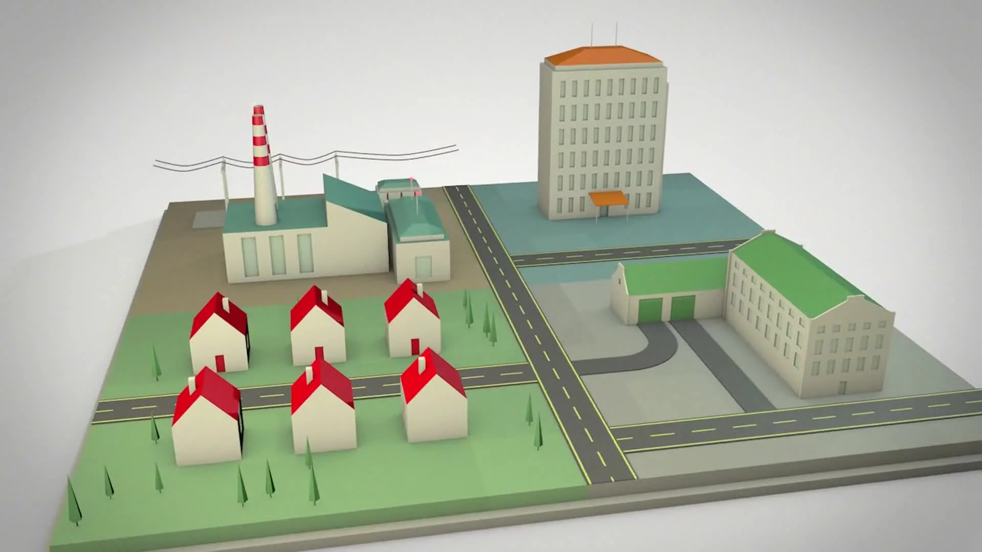
We jumped into Rapid Prototyping using Cinema 4D, working with basic geometry and placeholder textures to sketch out spatial design, animation flow, and conceptual clarity. The early builds were stripped down—houses without windows, neighborhoods rendered as silhouettes, graphs animated via Mograph—so we could nail layout and camera moves before refining visuals. Key animations like the solar home reveal and data stream effects were blocked in using Cloner and Fracture tools. Lighting was kept simple, just enough to define space and volume, while materials remained flat to keep rendering efficient.
This phase also laid the groundwork for visual metaphors: phones representing control, houses emerging from tablets, abstract graphs tracking energy trends. The look intentionally avoided realism and leaned into stylized abstraction. Client and internal feedback pushed for less geometry, tighter pacing, and a sharper visual language. One early note led to a major shift: the opening neighborhood sequence was further abstracted, stripping visual clutter to better support the brand’s bold, minimal identity.
Client Feedback Shaping Direction
Creative leads helped shape several key beats. One turning point came from internal feedback suggesting a tonal shift—from darkness into light—to visualize how Abacus “illuminates” the energy market. This was built into the video as a cinematic crescendo, climaxing in a sunrise moment where solar and wind elements unfold in a stylized lighting pass. Client feedback also steered simplification—eliminating unnecessary windows, textures, and color noise to tighten focus on layout and palette.
Direction stayed consistent on metaphor over literal UX. We created and tested several RP variations for the same scenes to fine-tune the abstraction level—enough detail to imply function, but always with conceptual clarity. Final consensus favored stylized graphs, mobile-inspired layouts, and clean, grounded spatial design, building a look that was unified, minimal, and forward-looking.
Production (Full Production / FP)
Look Development
With the foundation set, Full Production raised the visual bar. We kept the core layout and geometry from RP but upgraded every surface, light, and color detail using Redshift in Cinema 4D. Materials were tuned to reflect the brand’s aesthetic—clean plastics, soft gloss finishes, and translucent layering. The solar house used a particularly complex shader stack—semi-transparent surfaces with internal wireframes and subtle edge glow—to suggest data flow without visual overload.
To avoid sterile perfection, we introduced subtle imperfections—slight bevels, random surface irregularities, and soft roughness variation. Lighting was dialed in to balance softness with enough definition to separate elements from the white environments. This was critical in all-white scenes, where shadows and accents did the heavy lifting to guide the eye.
Design & Animation
Animation refinement took center stage in FP. All Mograph-driven transitions from RP were polished with detailed timing and easing. The solar house, for example, was given a multi-stage build with fracture mechanics, animated growth, and cloner transitions to make its reveal feel purposeful and snappy. Data animations were still procedural but fine-tuned by hand to feel natural and rhythmic.
The town sequence got a visual upgrade - tree coverage, varied house shapes, and refined camera moves. We used AO and subtle edge blur to add dimension without breaking the clean, stylized language.
UI elements were animated in 3D space, not composited later. Phones, graphs, toggles—they all lived in the environment, reacting to lights and casting shadows. This move kept visual cohesion tight and eliminated the “cut-out” feel you get from traditional 2D overlays.
Style Choices and Reasoning
The whole visual strategy required strict discipline: tight color hierarchy, minimal camera movement, and smooth, confident transitions. The camera style used slow dolly-ins and arc moves—no fast cuts. This wasn’t an explainer; it was a methodical reveal of the brand’s story. Backgrounds stayed clean and negative so the foreground could pop with contrast and color.
Every visual metaphor was directly tied to a core brand value—ease, control, transparency, affordability. The concentric-circle lightning bolt, for instance, showed energy access and flow; the pill-shaped bar charts spoke to optimization and wellness.
Technical Details
We built the production pipeline around Cinema 4D and Redshift. MoGraph handled most procedural animation. Key shots like the solar panel house used custom fracture setups for layered construction. Shaders were semi-PBR with tuned roughness, anisotropy, and SSS for realistic depth on soft materials.
Lighting used a combo of softboxes and area lights, with HDRI domes adding ambient fill without harsh shadows. Camera rigs followed spline paths or were parented to nulls for smooth, repeatable motion. Output was rendered in AOVs—depth, spec, diffuse, masks—for maximum post flexibility.
Heavy scenes, like the transparent solar home or wide flyovers, pushed render times up to five minutes per frame. We leaned on queue management and a render farm for final output.
Several shots used layered builds via Cloner and Fracture systems to simulate growth, assembly, or emergence. The data-dot sequences were animated with spline followers and delay effectors to create a natural flow. Matrix graphs were built from cloned spheres guided by splines, allowing last-minute reshapes and procedural fine-tuning.
For the day-to-night neighborhood transition, we skipped a second lighting pass and faked it in post—regrading a single daylight render with masks and exposure tweaks. That saved time while still delivering high-impact visuals.
Internal reviews focused on emotional continuity, with lighting and pacing evolving throughout the timeline. Key sections (solar, charts, provider switch) were isolated for feedback to streamline revisions.
Challenges and Solutions
Biggest hurdle? Balancing minimalism with visual depth. White environments need shadows and color accents to work overtime. That meant lighting, contrast, and timing had to be razor sharp. Data visuals like particle charts were another challenge. They got cluttered fast. We managed that by pacing the animations carefully and applying smart color gradients to walk viewers through the visual story without overwhelm.
Post-Production & Delivery
Final Compositing & Color Grading
Post was handled in After Effects. Redshift renders came in as multipass exports, giving us tight control over lighting, emissive elements, and overall tone. Color correction was handled with curves and targeted grading, keeping everything in line with brand palette and ensuring a consistent look across all scenes.
We added light vignettes and subtle sharpness to guide the eye and help title sequences pop. Key scene—the day-to-night transition—was executed entirely in post. A single daylight render was regraded with hue shifts and layered masks to simulate moonlight, syncing perfectly with the narration.Traditional VFX stayed minimal, but compositing helped amplify metaphors. UI glows, emissive data points, and particle trails got bloom passes and subtle motion enhancements. The goal was always clarity and restraint—effects served the story, not the other way around.
All infographics were built natively in Cinema 4D, but post helped with crispness. Fonts were tightened, scaled, and cleaned for readability across resolutions. Small interface elements—like toggles—were animated in AE for timing precision. We refined graphs and charts with easing functions, masked reveals, and tuned color gradients so data read clean without pulling focus.
Final Edits & Optimization
We wrapped post with a unifying pass to align tone, contrast, and timing across the board. Adjustment layers matched gamma and tone curves globally. Lighting or background shifts were smoothed out scene by scene. Each shot was double-checked for clarity, brand consistency, and compression quality.
Brand standards were baked into every step—from the first shader build to final compositing. Typography matched weight and spacing specs. No off-brand UI or colors made it into the cut. Every element reinforced the Abacus identity visually and conceptually.
Post feedback was all about refinement. Edits included warmth tweaks, type alignment, and minor timing shifts. Every request was implemented precisely, with updated previews shared regularly to keep approval loops short and focused.
Delivery
Final assets included a 1080p H.264 master ready for digital and event use, plus a collection of 4K stills pulled from highlight scenes. We also provided a web-friendly version with a white overlay (80–90% opacity) for better UI contrast without losing visual depth. Everything was delivered in a clean, organized package—ready to go across platforms.
Transcript:
Have you ever wondered where your home's electricity comes from, or how your energy provider decides how much to charge you? Or how to get started with renewable energy and make a real difference?
Legacy energy companies might prefer you stay in the dark about this stuff, but we think it's time to turn on the light.
Abacus Energy is a new retail electric provider that's all about empowering you.
We believe Texans deserve transparency about their energy use so you can spot the plan that's right for you, get your truly best rate, and know your energy supply is secure.
We offer customized retail plans with no hassle, provider switching, and unmatched visibility into your power consumption. And because we have granular insight into your energy usage, we can recommend and install a solar system solution that's right for your unique home and consumption profile.
Switch to Abacus today and see how we're raising the bar for energy providers.