MP2 Energy - Who we are (2015)
Pre-Production
Concept & Scripting
We kicked things off with a clear objective: show how MP2 Energy delivers customized power solutions using a clean, data-driven animation. From the beginning, this piece needed to merge MP2’s strategic capabilities—generation, purchasing, management, and consumption—into a client-facing visual built for the future. We were handed a core set of assets to shape the narrative and visual tone: MP2’s logo and brand guide, a detailed marketing brochure outlining their grid services and client tiers, photos of their custom-built conference table, and a complete list of energy asset locations across ERCOT.
The concept phase centered on translating MP2’s full service structure into a single spatial, rather than linear, storyline. We pulled inspiration from sci-fi interfaces, radial data visualizations, smart city dashboards, and enterprise analytics tools. A key early idea: turning MP2’s real conference table into a projection surface for a high-fidelity holographic interface. That gave us something tactile to ground the abstract data—and a clean, cinematic platform to run the visuals.
The voiceover script was the backbone, breaking down the story into clear segments: intro, regional control, client specificity, smart load balancing, and dynamic pricing. Each piece of that script needed a corresponding visual mechanic—map flyovers, holographic pop-ups, radial charts, modular dashboards. During scripting, we flagged key scenes for custom animation language, including data pulses across power lines, live dashboards, and dossier panels rising from the table surface.
Rapid Prototyping
Rapid prototyping started with pressure-testing the main visual metaphor: a holographic mat across MP2’s wood table, launching all animated content. Early tests used physical paper layered with UI elements, lit and textured like part of the table. Those were helpful but ultimately led us to a cleaner solution—a semi-translucent projection mat with grid lines and fine markers, resembling precision tools or architectural schematics. That move sharpened the style and made effects like light bloom and data pulses more visible without physical-world clutter.
We built the table from scratch in Cinema 4D, using reference photos of MP2’s actual conference room. We matched wood grain, corner joints, and the table’s inset details to ensure authenticity. The mat itself was a low-profile extrusion, UV-mapped to support procedural grid shaders that moved naturally with the camera.
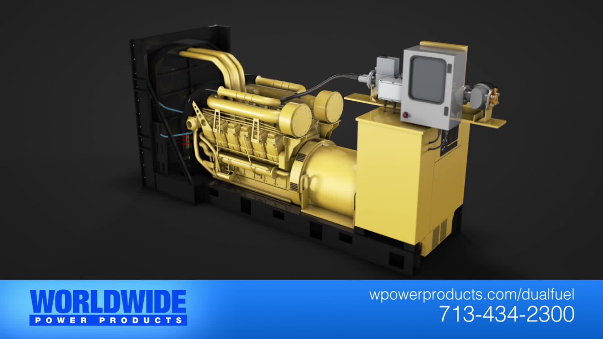
On the asset side, we imported and optimized a wide range of models tied to power generation and infrastructure. Some assets—solar panels, turbines—came from stock libraries. But others, like the Distributed Generation System (DGS), had to be modeled in-house. We used industrial references to design a modular unit that could logically connect to cable systems and fit known meter/substation aesthetics. All models were optimized for render efficiency while keeping clean silhouettes. We also grouped asset hierarchies to make MoGraph animations easier to manage.
A key part of RP was locking in the animation language for how each asset would come to life. Using Cinema 4D’s MoGraph tools, we applied linear and spherical Fields with Cloner and Fracture objects to “build” each element in place. Wind turbines rose from the ground using scale fields tied to Null sweeps. Power plants were revealed in vertical modular stacks with opacity shifts to create a live hologram effect. These were lit with preview lighting, then rendered as viewport-style clips for internal reviews.
Shader development was tackled early—since the holographic effect was central to clarity and consistency. We ran several versions of a “holo-shader” built from layered Fresnel gradients, emission maps, and procedural noise. For readability, we landed on a muted blue tone with glowing edges and alpha masks that faded geometry from a central pulse. Materials used light additive blending and rim lighting to make the visuals pop against the grid floor.
We also kicked off camera tests in this phase. The goal was a single, unified camera path that flew over the table surface, shifting height and angle to highlight key layers of info. We used smooth sweeps over Texas map segments to pivot between regional and client-level views. Camera motion was tightly synced with asset reveals and data pulses to keep viewer focus guided by movement—not just layout.
Prototyping Animation Concepts
All animation prototyping for MP2’s interface, data flow, and layered visuals was built entirely in After Effects. While Cinema 4D provided the 3D space—table renders and energy assets—the dynamic overlay system was prototyped natively in AE using a 2.5D workflow. The goal: create a modular interface that felt grounded in the physical table, but could conceptually scale to visualize real-time services, system flows, and client-specific outputs. Prototyping in AE gave us speed—allowing fast iteration on timing, clarity, and density.
Each UI cluster started as a design sandbox: radial graphs, bar meters, load gauges, node connections, dossier panels, and timelines—all built with shape layers, expressions, and precomp systems. We tested different behaviors for data entry: trim paths, scaling reveals, number ticks, sweep indicators, and opacity fades. Every parameter—timing, ease, sync—was controlled via sliders and time remaps to make layout testing fully flexible. Multiple UI categories were run in parallel—each with different pacing rules: overview dashboards, regional stats, client panels.
A critical step in prototyping was locking these UI elements into true 3D space. We imported full C4D camera and null data via external compositing tags into AE, allowing precise placement above the projection mat or at specific energy asset anchors. That gave us live parallax, shot-stable overlays, and seamless camera motion integration. This workflow meant we could test panel visibility, entry speed, and legibility—directly against VO timing and camera motion.
Client dossiers were one of the most detailed prototypes. Each version was built from a system of modular UI parts—dynamic bars, spinning indicators, multi-line graphs, embedded 3D clips (like turbines or solar rigs), and live value fields. Structured in AE 3D space with null anchors, the panels rose, rotated, and expanded from the tabletop in sync with camera beats.
The radial services interface—central MP2 button with orbiting bars—was another high-priority prototype. We tested rotation behaviors, expansion timing, text reveal flow, and data-driven glow responses based on user-selection logic. Every element was rigged in AE with expression controllers, enabling quick iteration of height, offset, and sequencing. As the narrative anchor of the whole piece, the radial system got heavy prototyping to lock down hierarchy and motion logic before final compositing.
Across the board, we validated UI density against clarity. Every prototype was evaluated across zoom levels, motion speeds, and visual rhythm. These tests helped us define where animation added value, where stillness created contrast, and where repeat motion built rhythm without clutter. Once validated, these AE builds moved directly into production as the structural base for final UI systems.
Full Production (FP)
Look Development
With RP approved, we locked in the aesthetic: a seamless holographic interface built into the surface of MP2’s custom wood-finished conference table. In production, we moved from concept shaders and quick viewport previews to full-resolution holographic materials designed for final output. Using Cinema 4D’s node-based material system, we built a modular holo-shader with animated Fresnel ramps, thin-film iridescence, and a glow falloff mask controlled by world normals. That gave us cinematic edge softness in low-angle shots, while keeping lines crisp in overhead views.
MP2’s color palette informed every decision—cyans, electric blues, and neon whites were used for core interface elements, while darker navy blues marked secondary UI and regional overlays. The wood grain on the table was rebuilt with 4K PBR textures, and specular/normal maps brought out the fine surface detail during close-ups. We refined reflection passes using a mix of area lights and reflection catchers. The end result was a look that felt tactile and grounded—but elevated and futuristic. It walked the line between physical realism and stylized abstraction, all while staying true to MP2’s brand.
Design & Animation
We started animation by assembling the master environment—a dark void surrounding a clean, well-lit table. Each narrative chapter got its own modular scene, timed precisely to the voiceover. The intro sequence featured a boolean extrusion of Texas rising from the table surface, layered with an emissive grid animated through ripple expressions to simulate energy waves pulsing out from MP2’s real-world asset nodes. Dot clusters were generated via cloner matrices built from actual ERCOT data, with cities like Dallas, Houston, and San Antonio getting extra logic to scale density and glow intensity based on real load activity.
Energy assets had their own motion choreography. Wind turbines rose up using procedural sweeps and vertical scaling. Solar fields deployed with MoGraph effectors using scale and delay fields. The DGS unit lit up with a pulse and extended cables through timed object reveals. Diesel and gas generators were made of cloner-based fan rigs, animated with staggered time offsets. We layered in slow dolly moves, lateral slides, and top-down shifts to create the feeling of scanning a 3D control system.
The camera rig was built as a single system using spline paths for base movement and Look At constraints for precise targeting. Transitions used gentle arcs and lifts to move logically from one topic to the next. In deeper data sequences like client dossiers or the radial service ring, we masked out the table entirely to keep the focus clean and reduce clutter. This gave us a spatial logic that could expand or contract based on content complexity without losing the viewer’s sense of orientation.
Style Choices and Reasoning
The style choices for this animation were grounded in one central idea: make complexity feel simple, and make data feel powerful. Everything was built around MP2’s position as a company that doesn’t just manage energy—they see it, predict it, and control it in real time. By visualizing that capability directly on top of their actual conference table, the design achieved a dual purpose: literal and metaphorical. The table became more than a piece of furniture—it was the platform, the command center, the operating system. It grounded the experience in something tactile, familiar, and credible. The holographic overlays layered on top transformed that physical space into a digital control environment, positioning MP2 as modern, analytical, and fully in command of an invisible, highly complex system. For the client, this style wasn’t just beautiful—it was strategic. It made their abstract value proposition feel visible and operational.
We committed to a consistent isometric perspective with slow dolly and pan moves—choosing clarity over cinematic spectacle. This wasn’t a style choice made for polish—it was made for legibility. MP2’s audience doesn’t need flash; they need understanding. Deep parallax and dramatic depth-of-field would’ve introduced unnecessary distortion and made data harder to track. By contrast, the isometric angle preserved spatial consistency. UI elements, graphs, maps, and dashboards all stayed anchored and readable, even during motion-heavy sequences. This perspective helped the animation communicate—not just entertain. That distinction mattered for a client like MP2, who sells performance and clarity, not hype.
Color followed MP2’s existing brand palette but was structured around function. Electric blues and bright whites highlighted high-priority interface elements. Dark navies and desaturated hues receded into background layers. This created an intuitive visual hierarchy that made complex UI elements easier to read and navigate. More than just matching the brand, the color logic did work: it guided the eye, emphasized data flows, and created separation between interface layers. That clarity helped MP2 tell a more intelligible story about their capabilities—how they monitor, predict, and manage energy in real time.
Motion was purposeful. Every move was tied to a narrative function. Camera pushes signaled deeper focus. Expanding radial charts represented system growth. Pulse effects tied directly to the voiceover’s pacing, emphasizing beats without distracting from them. Motion wasn’t aesthetic—it was instructional. It supported understanding. It made the platform feel alive, not just animated.
We made a deliberate decision to avoid hard scene transitions and instead told the story in one spatial environment. No hard cuts. No location shifts. Just one unified system unfolding across a single visual plane—the tabletop. That kept the user grounded and reinforced the core narrative: MP2’s platform brings everything together in one place. Texas rose from the table. Data nodes pulsed across known ERCOT regions. Client dossiers emerged from specific zones. Radial graphs orbited around a centralized MP2 hub. This spatial storytelling wasn’t just visually clean—it was on-brand. It aligned perfectly with the idea of MP2 as a centralized, intelligent interface for managing every energy variable in real time.
This style worked because it matched what MP2 is actually selling. Not just energy—but intelligence. Not just visibility—but control. Not just software—but trust. The style elevated their offering while keeping it grounded in operational clarity. It helped MP2 look like what they are: a modern, analytical, precise partner who makes energy make sense. For the client, the payoff was real. The animation didn’t just represent their brand—it functioned like an extension of it.
Collaboration & Revisions
We met with MP2 weekly throughout production. Their feedback was specific and fast. When they asked us to simplify UI panels to reduce cognitive load, we restructured layouts with clearer hierarchy and pulled back animation on secondary data. When they wanted a visual handoff between generation and consumption, we created a glowing power line that connected the entire map—bridging sites in real time.
Revisions were smooth thanks to our modular scene setup. Each sequence had its own control rigs, lighting, and render queues. That let us make updates without disrupting the broader pipeline. Every change was tracked and versioned internally so we could roll back or iterate quickly.
Post-Production & Delivery
Final Compositing & Color Grading
Post-production was just as critical to the final look as any modeling or animation—arguably more so, given how clean and abstract the visual system needed to feel. Once all scenes were rendered in Cinema 4D using the Physical Render engine with beauty, depth, object buffers, and luminance passes, everything moved into a detailed After Effects compositing pipeline. The goal: build a cinematic holographic interface world that felt immersive and data-rich, without ever tipping into visual overload.
Color correction and grading followed a layered approach. We applied targeted luminance smoothing to ensure holographic elements pulsed without blowing out in wide shots. Global grading was driven by a custom curves aligned to MP2’s palette—boosting electric blue mids and crushing blacks for punchy contrast around edge-lit objects. A subtle vignette, combined with chromatic aberration and light edge blur, gave each shot a grounded, lens-driven feel—bridging the gap between digital interface and cinematic real-world polish.
Glow was a key tool for visual hierarchy. Using Soft Light blending, we added an extra glow pass to UI lines, panel edges, and geometry highlights. Keeping this separate from render emissives gave us precise control—enhancing edges in dense scenes and dialing back noise in data-heavy views.
Chromatic aberration and depth-of-field were used sparingly but with intent—applied mainly at shot boundaries through AE’s camera lens simulations and Z-depth passes. These tools centered viewer attention and softened peripheral clutter. Every shot was framed in a consistent 1.33:1 letterbox to reinforce cinematic pacing and unify visual rhythm.
Infographics, UI Overlays, Data Visualization
The UI layer was the most complex and labor-intensive part of post. Every rendered 3D object—assets, regions, client panels—was enhanced with data overlays that felt like functional dashboards, not decoration. These weren’t just visual add-ons—they delivered the operational clarity MP2 stands for.
To maintain spatial alignment, we used external compositing tags and camera data exports from C4D to rebuild the entire scene inside After Effects’ 3D space. That ensured UI panels, charts, labels, and connectors tracked cleanly with the camera and respected the logic of the 3D projection mat.
The ERCOT grid map was entirely built in After Effects. Metro zones pulsed with animated dots reflecting inferred activity levels. Data lines were trimmed and glowed with animated oscillation to suggest real-time power flow—tying everything back to the tabletop environment seamlessly.
Client dossiers were some of the most advanced UI components. We created two core types with multiple visual variants, each built from stacked data modules—tables, graphs, meters, line charts, icon sets, timelines. Some even embedded rendered 3D loops (e.g., turbines, panels, generators) into the panel’s holographic layer. All panels animated from the table on the Z-axis, surrounded by radial flares, loading bars, and live metrics.
Every UI component was designed for realism and readability. Indicators ticked in sync with data, percentage bars reacted with inertia, and typographic hierarchy made text legible at every scale. Fonts were light sans-serif, with multi-color segmenting to clearly separate values and statuses.
The circular service interface was a standout: an MP2-branded center button with a radial structure of data bars that expanded and contracted based on category. Each bar carried its own icon, data meter, and label group. The entire sequence was locked to voiceover cadence, delivering a crisp and punchy visual crescendo.
Final Edits & Optimization: Brand Consistency
Throughout final comp, we held brand consistency as a top priority. Color, typography, UI layout, and animation behaviors all followed the internal spec developed earlier in production. We tightened copy, polished legibility in glow-heavy zones, and cleaned up final labels and captions based on late-stage review.
The MP2 logo animation got a final polish—smoother entry timing, boosted glow edges, and
Delivery
Final renders were exported at 1920x1080 with letterboxing baked in to preserve the 1.33:1 aspect ratio across all platforms. We delivered full-res ProRes files for primary use and compressed H.264 versions for web and internal distribution. Still frames were exported for future use.
Transcript:
We created MP2 Energy to bring the knowledge of electric power from creation to consumption under one roof in one room.
In deregulated markets like ERCOT and PJM, electricity is created by a variety of power plants, some that run on natural gas, some that run off the sun, some that run on wind, some that run on other fuels. We optimize and schedule generation from power plants at our 24/7 real-time desk.
See, when you know where and how electricity generation begins, then you have more comprehensive knowledge of how the market operates and how to deliver the most economic, lean kilowatt-hour of electricity.
As electricity is generated, it flows across power lines through your meter and service stops there. Other companies only see you as a monthly bill to be paid, but MP2 is different from the other companies.
Whether you're a large industrial energy manager, school administrator, homeowner, energy consultant, we consider you a client. What's the difference, you ask? Instead of a standard product from the manufacturer, our clients have their own unique needs addressed. Bespoke, custom to the way they operate. No two customers are alike and many times your energy solution is incomplete. Your electricity needs don't stop at the meter.
At MP2 we recognize that there's more to electricity than flipping the lights on. As part of our holistic operating portfolio, we provide our clients with customized solutions that go beyond traditional power service. We review your consumption. We help you find innovative ways to manage costs like products indexed to natural gas prices, tapping into existing resources for demand response, and integrating on-site and off-site renewables.
We provide smart delivery, changing the electricity that is delivered to your meter. There are many options that constitute the everything in between creation and consumption, where MP2 delivers superior value to our clients and will always push the boundaries of how you buy, create, consume, and manage your power.
That's who we are. MP2 energy.