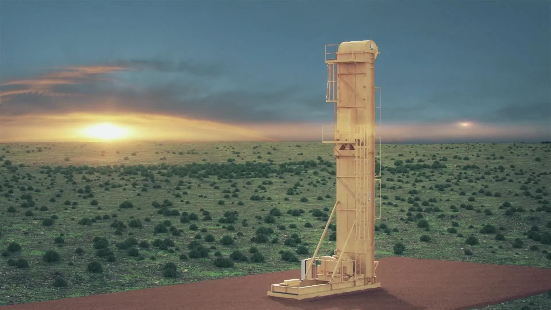
Product video - Construction
Pre-Production
Concept & Scripting
The animation was built to communicate the Complete Block Company’s patented wall system in a way that felt technical but approachable—striking a balance between industrial credibility and clear visual storytelling. The tone had to match the brand’s focus on innovation, strength, and streamlined execution, all while delivering the message in a fast-moving, high-clarity format. From day one, the structure centered around a clean, modular assembly sequence with zero visual clutter. The product's geometry and structural logic were the stars—everything else stepped back.
At kickoff, the client handed over key foundational assets: vector logo files, construction reference photos (bolts, epoxy capsules), and a comprehensive set of images of their proprietary blocks from multiple angles. These grounded the modeling process, giving us everything we needed to recreate the components faithfully in 3D.
We built the visual language in Cinema 4D, leaning on the physical renderer to hit that semi-photorealistic finish—crisp lighting, believable material interaction, and tightly managed surface behavior. Post-production ran through After Effects, where we used 3D data passes from C4D to integrate overlays, callouts, and final compositing in a way that stayed anchored to the scene.
Rapid Prototyping
Rather than walling off Rapid Prototyping as its own isolated phase, we built RP directly into the production pipeline. Early motion, layout, and scene work evolved organically into final sequences. This approach gave us a fast feedback loop and let us validate key ideas early—like how to visualize capsule placement, grout behavior, and rebar positioning in a way that made sense immediately on screen.
A key design challenge was translating the “CB” logo into something physical—built from the same blocks seen throughout the piece. That transformation had to feel intentional, not ornamental. The assembly logic of the logo matched the logic of the wall build itself, creating a thematic bookend that tied the whole thing together.
All geometry—from blocks to capsules to reinforcement hardware—was modeled from scratch. Early MoGraph setups drove block stacking and capsule placement using linear and step effectors. For grout testing, we pulled RealFlow into the pipeline to explore flow behavior in tight spaces. Camera logic, lighting tests, and material setups were also staged in RP, giving us quick visibility into what worked, what didn’t, and where we needed to push clarity. Boolean-based cutaways were also prototyped during this time, giving us a precision-driven way to reveal the wall’s inner structure without breaking geometry.
This iterative RP structure gave us room to test pacing, staging, and readability while keeping production momentum high and client feedback tightly integrated.
Early Visual Styles Explored
We locked in on a “clean realism” aesthetic from the beginning—semi-photorealistic, but never over-polished. Visual clarity was the priority. Smooth camera work, wide neutral backdrops, and soft ambient lighting helped support that. Early look development leaned heavily on material fidelity—especially for the concrete slab, foam interior, and steel components. Surface realism had to walk a fine line: believable texture and wear, but clean enough to reflect the new-product precision of the brand.
The environment followed a light-gray palette to create max contrast against the block system. Color hierarchy was intentional: neutral base tones for the build, dark gray for grout, cool muted steel for rebar, and brand blue reserved for typography and end-frame graphics.
Shader development was focused on realistic surface response without heavy stylization. Foam was shaded using high-frequency displacement noise and soft falloff to imply texture without overwhelming the frame. Concrete pulled from roughness maps and subtle albedo variation to hit a lightly troweled finish. These setups carried straight into the final scenes.
Prototyping Animation Concepts
Most of the motion system was developed using Cinema 4D’s MoGraph toolset. Blocks, capsules, and grout sequences were all staged using procedural logic instead of traditional keyframes. That made it easy to reorder, stagger, or re-time elements as feedback came in. Capsule drops followed gravity-aligned splines; the green grout hose followed dynamic spline deformation with layered delay to simulate natural movement.
Grout simulation, driven through RealFlow, was one of the more technically complex RP efforts. We started with high-viscosity presets to reflect the client’s “buttermilk” analogy, but dialed it back to keep the flow visually clean. As the wall height increased from 8 to 10 bricks during production, we re-meshed and recalibrated domains to keep timing and physics in check.
Client Feedback Shaping Direction
Client feedback played a lead role in refining the piece. Notes came in early and often—everything from capsule visibility and rebar positioning to wall height and text pacing. Midway through production, we received a wave of requests for added clarity: clearer epoxy behavior, more visible rebar runs, and sharper callout placement for things like pre-drilled holes and block dimensions.
These revisions directly reshaped several scenes. The epoxy animation was slowed down for clarity, a second horizontal rebar was dropped, and wall height was extended. We also adjusted the text system—switching from angled overlays to front-facing callouts to improve mobile legibility. The cutaway scene expanded to show three distinct rebar channels, helping reinforce structural integrity in a clear, on-brand way.
Marketing flexibility also required alternate versions of strength claims. We built “20x stronger” and “10x stronger” variants to accommodate evolving messaging. The final decision landed on a labeled cross-section that placed the strength metric front and center—easy to read, impossible to miss.
Every round of feedback pushed the work closer to what it needed to be: educational, visually clean, and engineered for clarity.
Production (Full Production)
Look Development
Full Production started with a focused look development pass, dialing in material accuracy and lighting fidelity to bring the prototype foundation into a high-fidelity, near-real visual system. Every surface—from foam cores to concrete slabs to the patented block components—was tuned using high-resolution textures and physically based shaders. These materials were built to feel industrial but refined: subtle wear, slight specular variation, and controlled reflectivity gave each asset just enough realism to sell the concept without overcomplicating the visual field.
Lighting was handled through a direct lighting system, designed to cast soft-edged shadows that clarified spatial relationships without harsh contrast. Ambient occlusion passes were layered in to ground floating components like the block stacks, while rim lights helped define form during top-down assembly views. The lighting direction was clear: bright, spatially legible, and visually minimal—more architectural than cinematic, by design.
A consistent light-gray studio environment was used across the board to focus attention on build logic. Shadow behavior was tuned carefully—falling gently beneath blocks, hoses, and capsules—to avoid the sterile flatness often seen in CG-heavy environments and preserve the illusion of grounded physical motion.
Design & Animation
Construction logic was driven procedurally inside Cinema 4D using the MoGraph system. Block stacking used step and linear effectors to choreograph precise, rhythmic placement—blocks lifting, rotating, and aligning exactly to maintain the requested running bond pattern. Motion constraints ensured accurate positioning, even as assembly tempo increased.
Animating the hose required a more technical solution. We used spline deformation to create smooth arcs, giving the green grout hose natural, weight-based motion that matched the timing of grout flow. These motions were refined throughout production, especially to address visibility and entry-point feedback.
The wall cutaway was constructed using Boolean geometry, allowing clean slices through the layered block system without compromising geometry fidelity. This gave us full control over the visibility of internal components—foam, epoxy, rebar, grout—while maintaining the motion hierarchy needed to animate each piece independently.
Grout Simulation
The grout pour was the core of the sequence—both visually and narratively. RealFlow was used to simulate this process, chosen specifically for its control over fluid dynamics. Early test sims used high-viscosity settings to match the "buttermilk-like" behavior described by the client but looked too thick on screen. We rebalanced SPH solver parameters and increased particle resolution to achieve cleaner surface tension and smoother directional flow.
Each vertical cavity was defined by the internal block geometry. After client feedback requested visible flow across three rebars in one continuous wall cutaway, we expanded the sim domain and rebuilt geometry placement to support a wider visual field. This required new meshing passes and simulation recalibration to maintain timing and flow coherence.
To simulate pressure lag and gravity-fed flow, we introduced delay offsets at the emitter level. The grout filled each vertical channel before bleeding horizontally into grooved channels between blocks. We used custom emitter placement and collision logic to control flow transitions, reinforcing the idea of engineered material behavior—not just fluid movement. Grout was tuned to hug internal surfaces without jitter or breakage.
RealFlow meshes were then imported into Cinema 4D and synced to the animation timeline. We built a custom wet grout material—glossy, darker than the dry elements, and tuned with roughness maps to simulate partial curing. Alembic caches were baked for performance stability and to eliminate flickering across re-rendered shots.
This sequence was iterated multiple times. A major update came when the wall height increased from 8 to 10 blocks. That change required adjusting the simulation domain, extending flow timing, and rebalancing pacing. Final sign-off only came after detailed feedback confirming that the visuals effectively conveyed the client’s engineering advantage.
Style Choices and Reasoning
We chose a semi-photorealistic visual style on purpose. The goal was instant visual comprehension—not over-polished realism. The minimal studio backdrop, clean motion sequences, and camera choreography all supported that clarity. Stylized brand moments—like the blue ink forming the “CB” mark—provided contrast, acting as punctuation to the otherwise grounded visual language..
Cameras were spline-based and tied to nulls for easy timing edits. Animation was built in segments, allowing us to render multiple cuts in parallel. Render passes included beauty, AO, shadow, and Z-depth, all exported in 16-bit to give full range in comp without banding or value loss.
Challenges and Solutions
Grout simulation was the heaviest lift. Realistic fluid behavior didn’t always read clearly, and stylized versions risked looking fake. By tuning viscosity, adjusting domain scale, and layering emitters, we landed on a sim that was both visually clean and technically credible.
The lack of voiceover meant timing and spatial composition had to carry the narrative. We had to guide the viewer’s eye with motion speed, lighting contrast, and deliberate framing—no narration to clarify the message. Frequent internal reviews helped keep the focus on clarity. Every shot had to say one thing, and say it well.
Post-Production & Delivery
Final Compositing & Color Grading
Post work in After Effects centered on spatial clarity, brand tone control, and reinforcing product benefits with timed animation overlays. Camera and null data were pulled directly from Cinema 4D to ensure every annotation stayed locked to the geometry—hovering above blocks, pointing directly at epoxy holes, and orbiting around the final logo without drifting or visual lag. Everything stayed grounded in the 3D environment, and every label landed exactly where it needed to.
Color correction was kept tight and intentional. Using levels, curves, and targeted saturation, we made contrast adjustments that guided the viewer’s eye without disrupting the soft industrial palette defined in the render phase. The goal wasn’t to stylize—it was to sharpen. Blocks needed to feel tactile, foam needed to hold softness, grout had to show depth. We adjusted black levels and shadow softness frame-by-frame, especially during the grout pour and block cross-section shots, to preserve visual depth and prevent clipping.
Transitions were handled in comp, using animated masks and displacement-based wipes to move fluidly between phases—stacking blocks, simulating grout, showing exploded views. These transitions maintained the build momentum throughout. The final pullback revealed the call-to-action alongside a fluid logo and tagline reveal, layered with subtle ink effects to reinforce the brand’s blue tone and give the close a clean, punchy finish.
VFX Enhancements
Visual effects were used sparingly but precisely to support realism without getting in the way of the structure-first story. We introduced depth of field selectively—mostly in tight shots like the epoxy drop and hose-follow—using Z-depth passes exported from C4D and lens blur filters to preserve consistency.
The final logo beat featured a stylized ink drop that morphed into the “CB” mark. Built with matte reveals, gradient masks, and displacement mapping, the sequence gave the close a slight digital edge. We held back on chromatic aberration and glow effects except for that final hit—just enough to make it pop without breaking the grounded tone.
Motion blur was rendered natively in Cinema 4D, then fine-tuned in post where needed—especially in fast-action areas like capsule drops and block placement. Frame blending helped remove any visual strobing that came from procedural motion.
Infographics, UI Overlays, and Data Visualization
All technical callouts—block dimensions, material specs, engineering metrics—were composited as in-world elements. No flat overlays, no UI cards that pulled the viewer out of the scene. Text moved with the product, driven by camera-tracked nulls and eased keyframes to feel physical and intentional.
This approach kept critical details like “Pre-drilled Holes,” “Epoxy Capsule,” and “10x Stronger Grout” clear without disrupting realism. We used a minimalist sans-serif font and brand-aligned colors to maintain contrast and readability across platforms—especially mobile. That mobile-first readability drove several text placement decisions during post.
The block dimension graphic was updated to read “32" x 12" x 11"” per client request, repositioned for legibility, and held longer on screen during the product reveal. The frame was composed for clarity, letting that sizing data land cleanly on both large displays and phone screens.
Final Edits & Optimization
Last-mile changes focused on syncing the piece with revised messaging. “20x” strength was softened to “10x” for regulatory caution. The info card reading “Metal studs are drywall ready—No expense for framing or insulating” was shifted earlier in the timeline and visually pushed closer to camera for better mobile legibility.
To underscore the product’s performance credentials, we introduced two full-screen intertitles near the end: “FEMA Tested Against F5 Tornado Debris” and “Wind Load Tested for 211 mph.” These were composited over darkened backgrounds and faded in cleanly—adding both technical authority and emotional weight before the final logo lockup.
Final QC rounds also included physical layout changes: we removed the second horizontal rebar, pulled rebar from the bottom course, and widened the cutaway view to show grout flowing around all three rebars. These updates required new simulation passes, updated lighting, and compositing changes to match the revised specs.
We held the brand line across every layer—typography, palette, animation cadence, and messaging tone. The concrete grays and steel blues anchored the visual system. Callouts, graphics, and logo movement reinforced the Complete Block brand at each step. Font choice stayed modern and legible, favoring neutrality to keep the tone technical.
The final branded line—“Better. Faster. Stronger.”—was integrated just before the contact URL. It gave the piece a clean close with a clear hook. The URL itself was restyled and aligned with the logo to solve early readability issues flagged in internal reviews.
Delivery
Final exports were delivered in both H.264 for web and ProRes for high-quality playback. Standard resolution was 1080p, built for mobile screens and large-format display at trade shows or client meetings. No VO or captions were included by design—the piece was engineered for silent clarity through strong visual storytelling.